
It seem to me the logo has change
or maybe my eyes are going.
Sure looks differant. Loof sitting on a box
stinky is fatter,
Qookie has a nice Tan
Puegee has a bigger smile.
They must like all the changes
Is the logo new?
Is the logo new?
O"Cathy"X's
Original Member#563
Proud member of FOWL, Ramblers,PITA,CNC,CLUBS
Original Member#563
Proud member of FOWL, Ramblers,PITA,CNC,CLUBS
-
Katja Doolewerdt
- Rainbow Wizard
- Posts: 434
- Joined: Mon Aug 09, 2004 3:17 pm

-
Little Lulu

- Gold Wonderlander
- Posts: 70
- Joined: Sun Jul 31, 2005 10:47 pm
- Location: Beebleberry R.F.D.
I guess I will be the odd person here and say that Iliked the other one better. The new one looks like a cartoon. The old one (below) shows what Wonderland is and the good graphics. I liked the 3d look and it was very cool. This one is just silly. The other one is much better. That is just myopinion. And I hope no one gets mad at me.
You do not have the required permissions to view the files attached to this post.
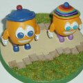
The new one is from the picture screens in Secret Worlds, that's why it looks cartoony. I've just used the self same pictures in the graphics for a 'certain' something, as they were much clearer pictures than the older 3D characters. I think maybe they could have been arranged a little better to make a more pleasing picture, but I think it looks ok. 
Pauline

-
Midnight Synergy

- Site Admin
- Posts: 2382
- Joined: Wed Nov 05, 2003 3:39 am
- Contact:
I figured "new forum look, new logo".
I'm actually thinking I might do an official logo competition in the future - perhaps tied in with a long-suggested T-Shirt compo that some other forumites had mentioned to me? But there are a few things I need to do first, so sit tight.
BTW, Qookie was always a little darker. You can even see that in the old logo. Must be all that mountain sun (once the fog is burnt off).
I know you've all had discussions and decided Qookie was female, but I've never thought so. Especially in the new logo, Qookie looks even more male.Lillian wrote:I prefer the old one - looks more solid and definedQuookie looks a very strange colour - I this she has turned into an olive
Re: Is the logo new?
Loof needs to sit on the box, otherwise he's hidden by Puegee's big head..... opps I mean hat.the cat wrote: Loof sitting on a box
Puegee has a bigger smile
All in all I like it
PS. Andrea, I've always thought Loof looked like a female, it's not only the purple shoes, but the colorful rainbow hat.. I mean get real what male wears "rainbow colors".
Be kinder than necessary, for everyone you meet is fighting some kind of battle.
Re: Is the logo new?
EXACTLY!laura n. wrote: PS. Andrea, I've always thought Loof looked like a female, it's not only the purple shoes, but the colorful rainbow hat.. I mean get real what male wears "rainbow colors".
Well, unless Loof is male and of a different "lifestyle", so to speak.
Andrea

Re: Is the logo new?
Andrea wrote: EXACTLY!
Well, unless Loof is male and of a different "lifestyle", so to speak.
Andrea
Be kinder than necessary, for everyone you meet is fighting some kind of battle.